
New logos for Google apps
If you use apps like Gmail, Google Drive and Google Calendar on a daily basis, chances are they will soon look different. This is because Google is working on a major redesign of the icons within Google Workspace.
The new style revolves around two things: more clarity and a stronger focus on AI. The familiar four Google colours will remain, but will be applied less strictly. Instead, you will more often see gradients, as you already know from other Google services. With this, the company wants to show that AI plays a bigger role in these apps.
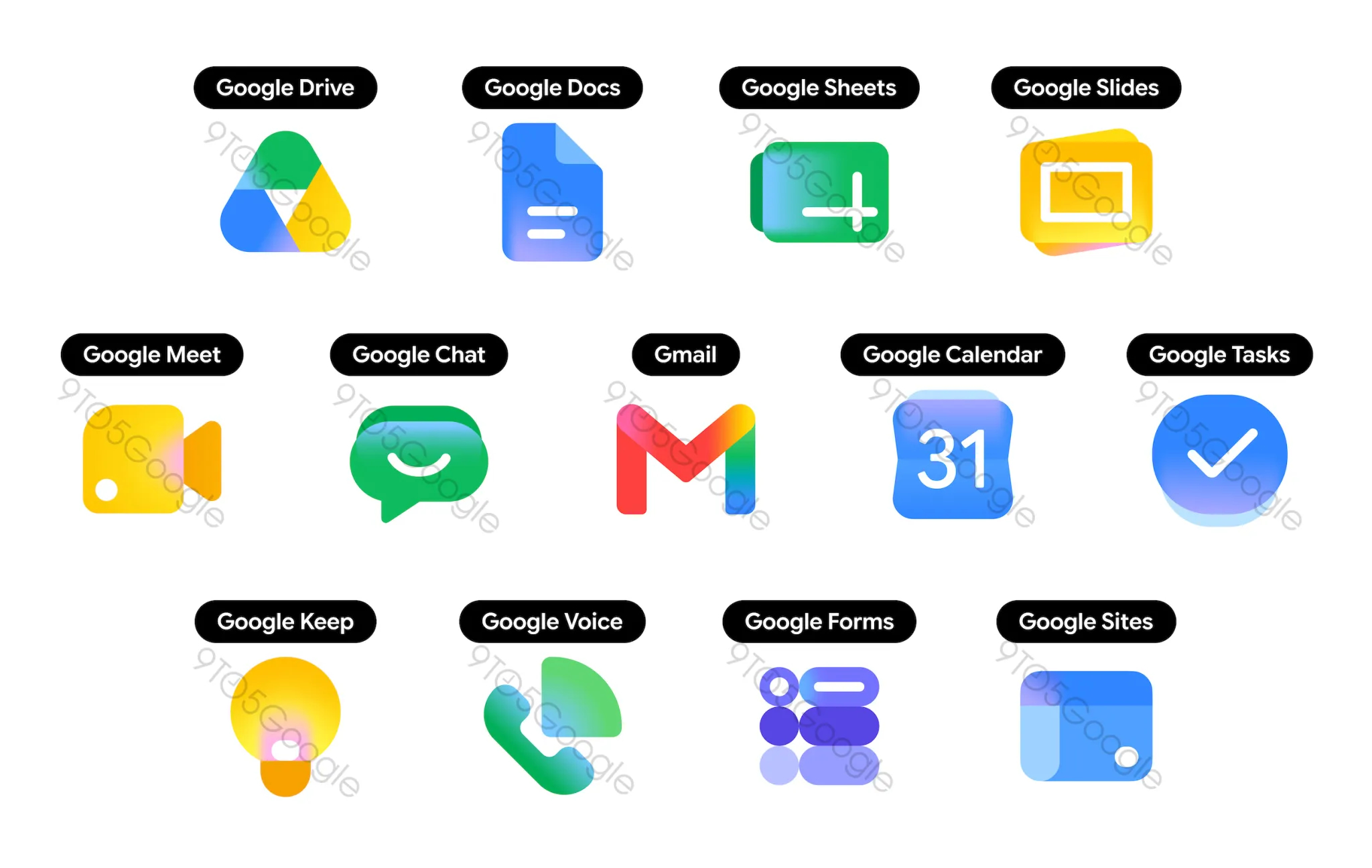
What does that mean concretely? The icons will become simpler and should be more recognisable. For instance, in many apps, the 'background container' disappears, making the icon itself bigger and clearer. With Google Drive, for example, you will see a softer-shaped triangle with flowing colours, while editor apps such as Google Docs, Google Sheets and Google Slides stay true to their recognisable colour, but are subtly changed in shape and layout.
Other apps also get a new look. Google Meet gets a striking yellow accent, while Google Chat gets a more playful design with a rounded speech bubble. For Gmail, the familiar 'M' will remain, but with more emphasis on red and a softer shape, making the icon stand out more among other apps.
Interestingly, Google Calendar is actually taking a step back in style, with a simpler blue design reminiscent of older versions. Google Tasks also gets a minimalist update.
For you as a user, this mainly means a fresher and clearer interface. The apps continue to work the same, but look more modern and consistent. The post talks specifically about the Workspace apps. It is currently unclear whether the new design will also come to average users.
Via 9to5Google