
Google Keep with new design
Google is rolling out an update for its Google Keep app. Google's own note-taking app gets the fresh Material 3 Expressive design. This style will be introduced with a future update to Android 16, but can already be found in several applications. We already saw the new design in Gmail, for instance, and recently we also saw the new design in the Google Calendar app on your Android device. In Google Keep, the new interface is also live.
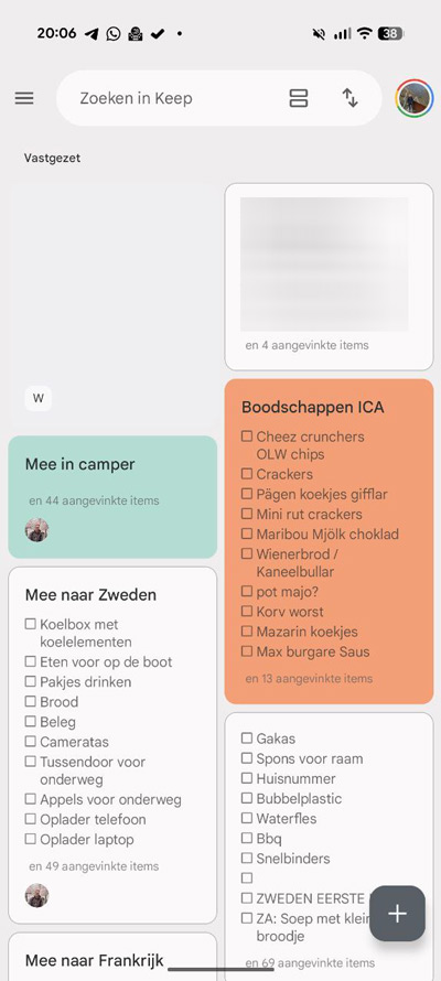
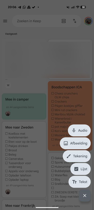
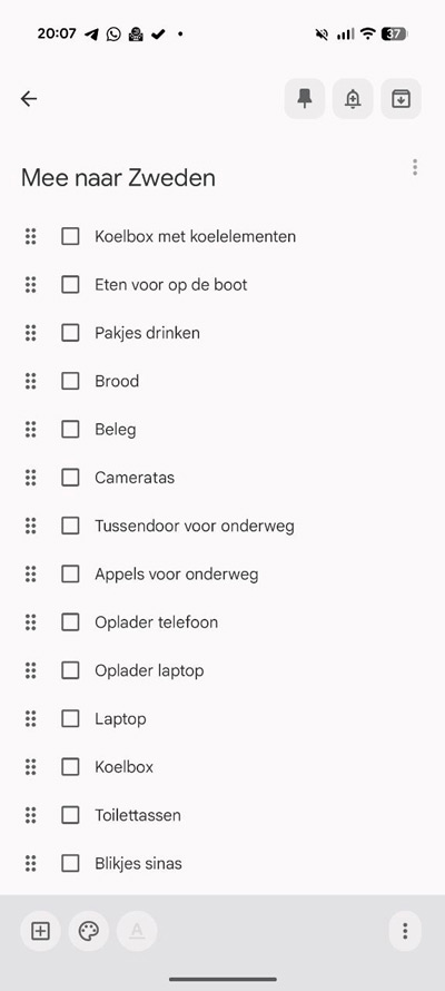
Google Keep looks tighter again with the new Material 3 Expressive sauce. This includes the revamped search bar at the top of the screen. From the search bar, you can also sort directly by, for example, the created or custom date, or a custom order. You can also choose a different kind of view from the search bar, e.g. using maps. At the bottom of the screen you will find the plus button that allows you to create new lists and notes, with both text and an icon. The notes screen itself has also become a bit clearer, with icons for pinning, reminding and archiving in rounded squares. A few other improvements have also been made.
The new design for Google Keep is available to users from now on, with the change being implemented via a server-side update.
