
New design for Gemini
Changes are coming in rapid succession. After previous updates in February and March, this is another big step in how the assistant looks and works.
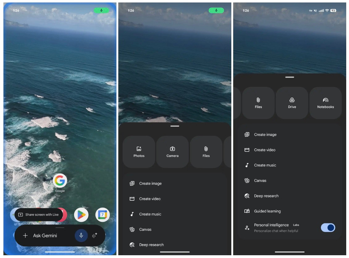
For the Gemini overlay, the screen you quickly call up, the design has been tweaked and made more uncluttered, 9to5Google writes. The menu for attachments and tools has now been merged. As a result, you have fewer separate options and everything feels a bit more compact. The input bar has become slightly narrower, while the text "Ask Gemini" is actually more visible. The microphone icon has also been given a new look.
Tap the plus sign and a new menu appears from the bottom of your screen. At the top, you will see a carousel of options such as Photos, Camera, Files, Drive and Notes. These are displayed as large, rounded buttons. Below that, you'll find additional features like image, video and music creation, as well as options like Canvas, deep learning and guided learning. Some features, such as personal intelligence, you can turn on or off yourself.
Gemini Live
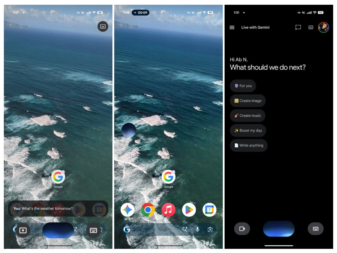
Gemini Live, the feature that lets you talk directly to the AI, also gets a different look. Instead of a big bar filling almost your entire screen, you now see a floating interface. In the centre is a waveform that responds to your voice, with buttons for screen sharing and the keyboard next to it.
Conveniently, this overlay gets smaller as you navigate through your phone. This way, Gemini remains available without taking over your screen. You will also see this change in the full app: the fullscreen view gives way to an overlay on top of the home screen.
The new interface is currently visible in the beta version of the Google app. If you're using the stable version, you'll probably have to wait a while. As is often the case with updates like this, it may take a while before everyone has access.
