
Google Photos and Maps with new icon
Every now and then, Google gives its apps a new look. With this, not only the apps themselves get some changes, the logos are also revised every now and then. This is now the case with the Google Photos and Google Maps apps. Although both apps still have the hitherto familiar icon, an update for these icons is in the pipeline. After Google Search' s new logo and Gemini's revamped icons, Photos and Maps seem to be next in line.
Back in September, Google revealed that it is staying true to the company's four iconic colours. These are green, red, yellow and blue. We are already seeing these in the logos as well. With more bright hues and the gradient design, Google wants to express the increase in AI-driven innovation and creative energy in service.
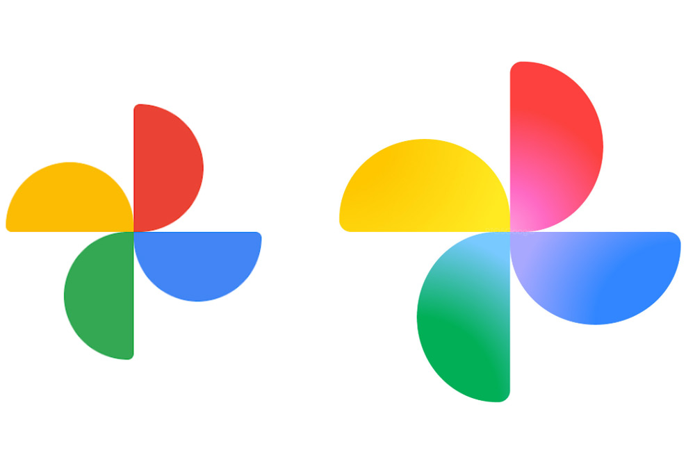
At Google Maps, the new icon is still a pin, but we see a thinner, modernised shape. The circle in this pin is larger, and we see a complement of colours. The diagonal lines from the current logo are thus a thing of the past. For the Google Photos icon, we see the same shape, but again with the gradient effect.
What do you think?
It is not known when Google will roll out the new icons widely. What do you think of the new icons?
Via 9to5Google