

Theme icons
Since Android 13, you have had the option to have app icons match the colours of your background to make your home screen look more consistent. Despite this option, relatively many third-party apps still never implemented it. With Android 16 QPR2 Beta 1 released in August, Google is testing forced theme icons. The system can apply a monochrome theme to icons, matched to the set background.
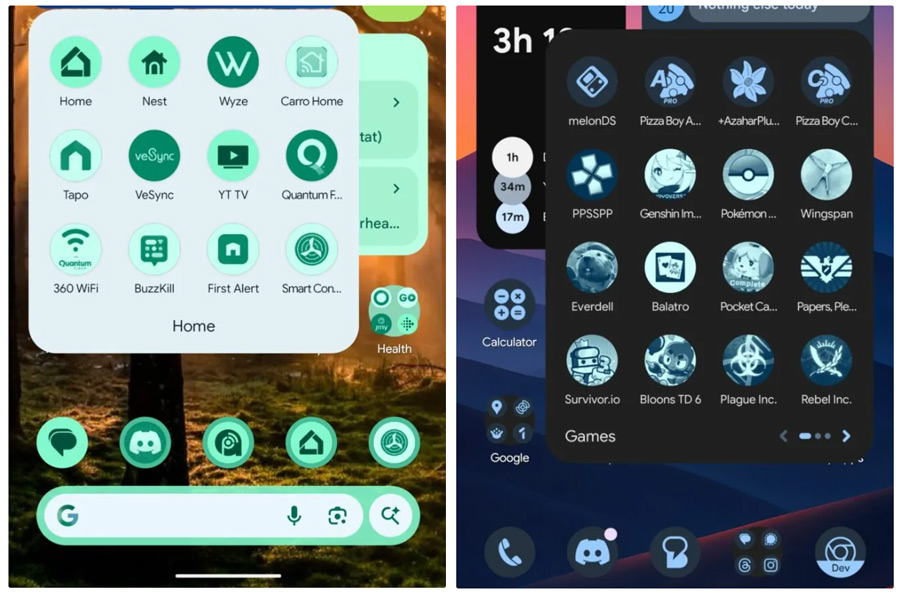
Adjustment in terms
To ensure this does not cause any legal problems, Google has amended the Google Play Developer Distribution Agreement. Section 5.3 now states that as a developer, you grant a non-exclusive, worldwide and perpetual licence to use, change colour or theme your app's icon. This allows users to benefit from the new feature without restrictions.
Existing developers have until 15 October 2025 to accept these new terms. New developers must comply with them immediately. With this, Google wants to prevent brands from objecting to changes to their icons.
More than just icons
Android 16 QPR2 brings a second major improvement: expanded support for the dark theme. Until now, many apps did not offer dark mode, leaving the experience inconsistent. With the new feature, Android can reverse light interfaces automatically as soon as you enable dark mode. While Google officially calls this an accessibility feature, it also makes the experience more practical for anyone who likes to consistently use a dark view.
What this means for you
As a user, you get a home screen that looks calmer and more consistent with these themed icons, without depending on developer choices. In addition, you won't have to switch between light and dark interfaces as often, as Android now handles that task itself. For developers, this means a liability, but for you, more importantly, more visual unity and ease of use.